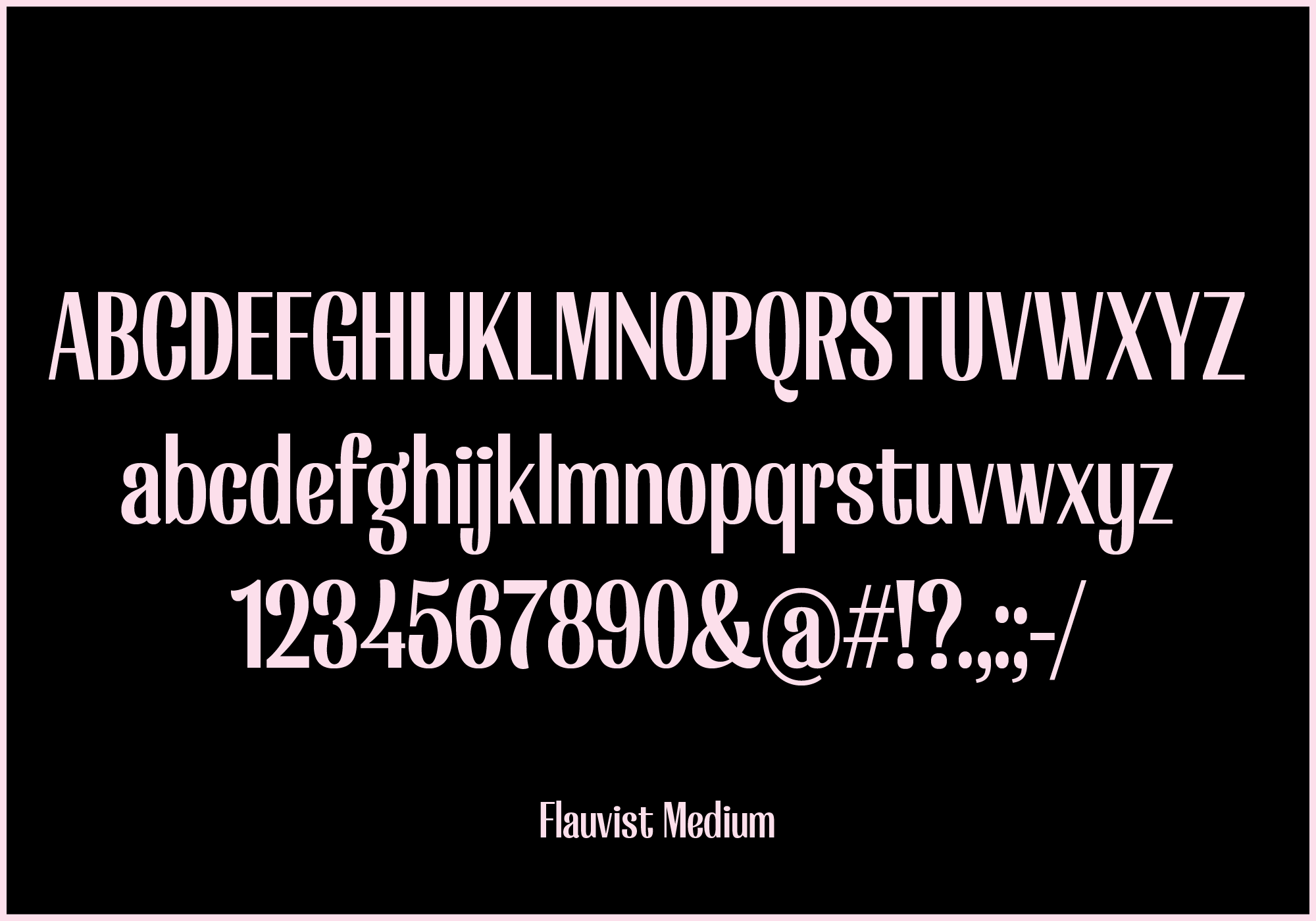
Flauvist
Following my passion on typography, I created Flauvist with the intention to break some of the norms of type design. By blurring the lines between a display typeface, as well as the definition of a high-contrast typeface, I hope it has the best of both worlds.
I always like to mix things up. Type design is often seen as a strict and serious thing that often scares people away. That makes me want to create unexpected stuff even more.
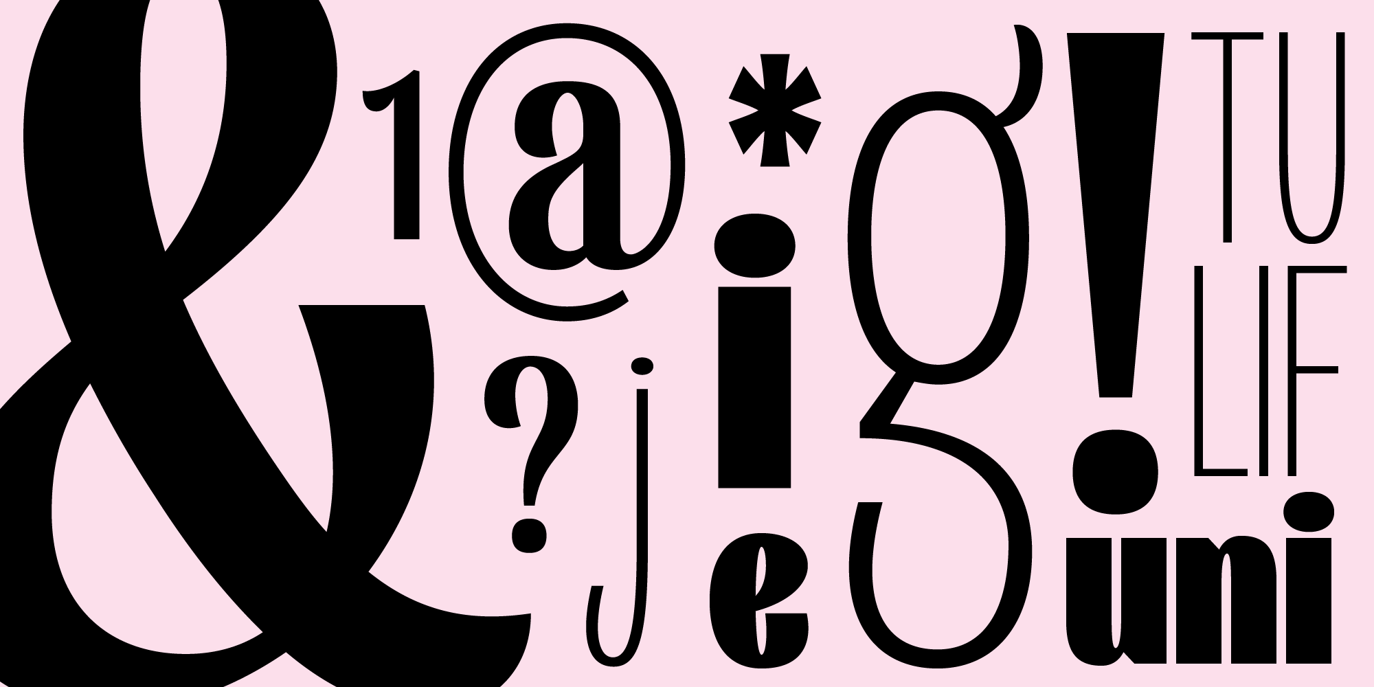
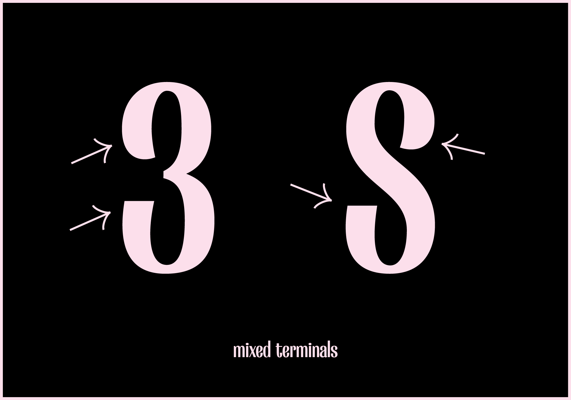
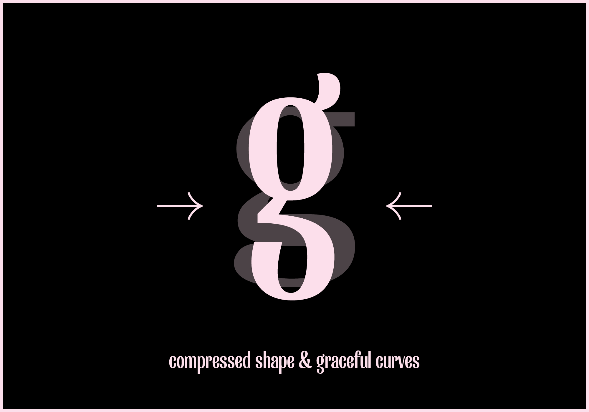
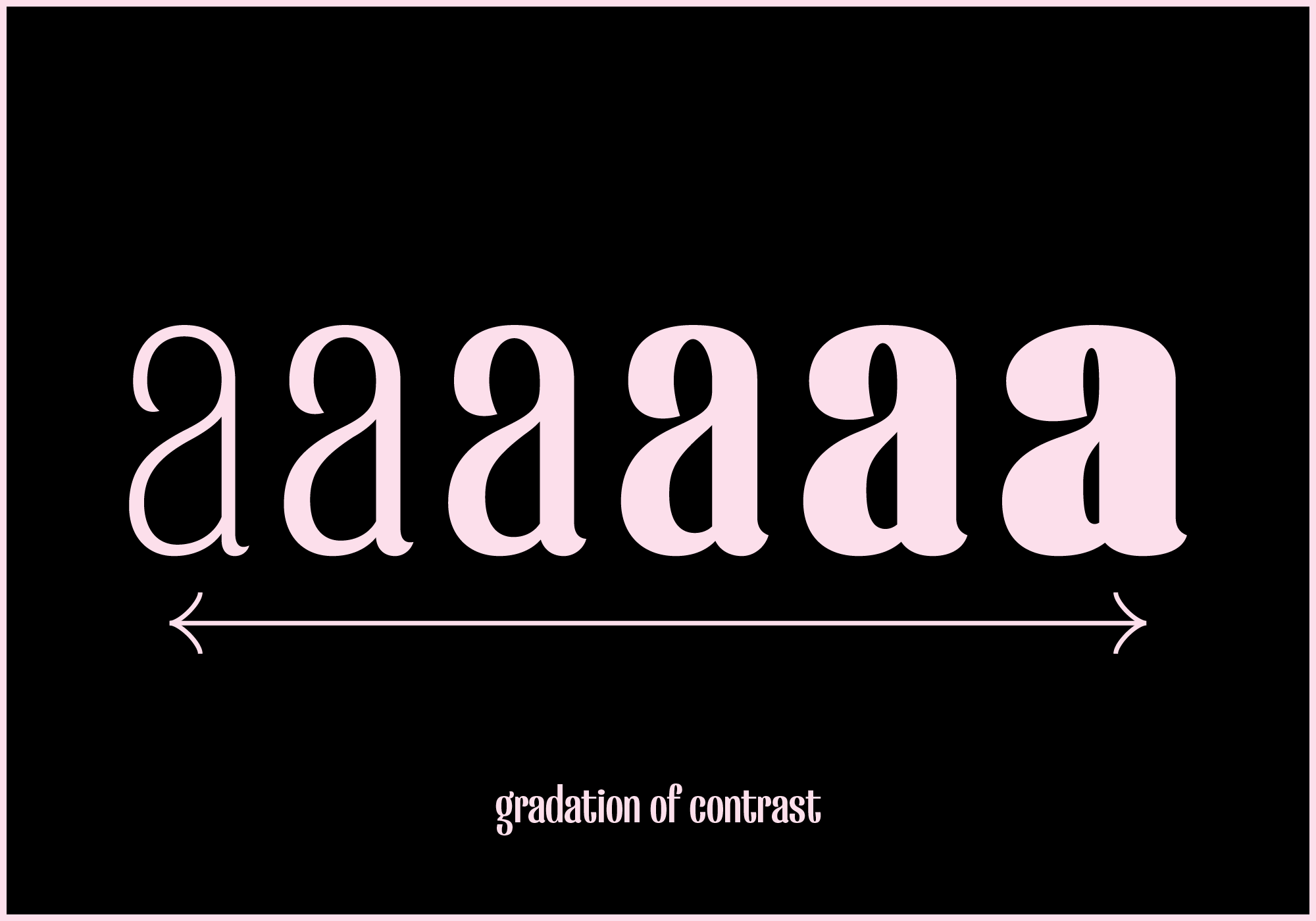
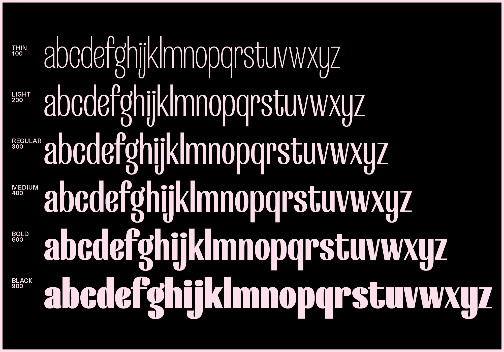
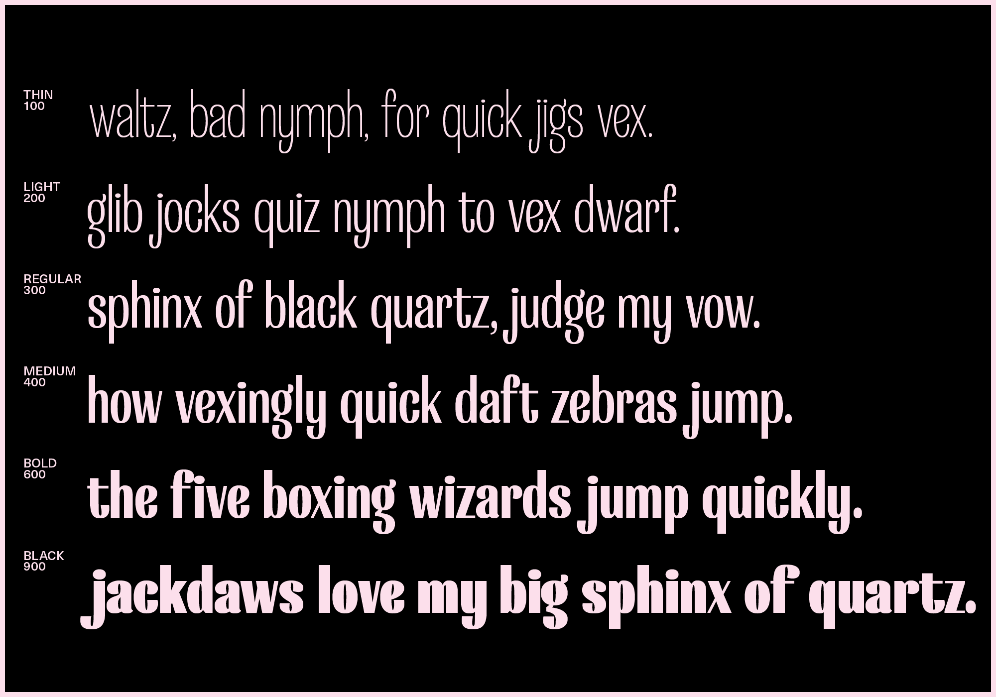
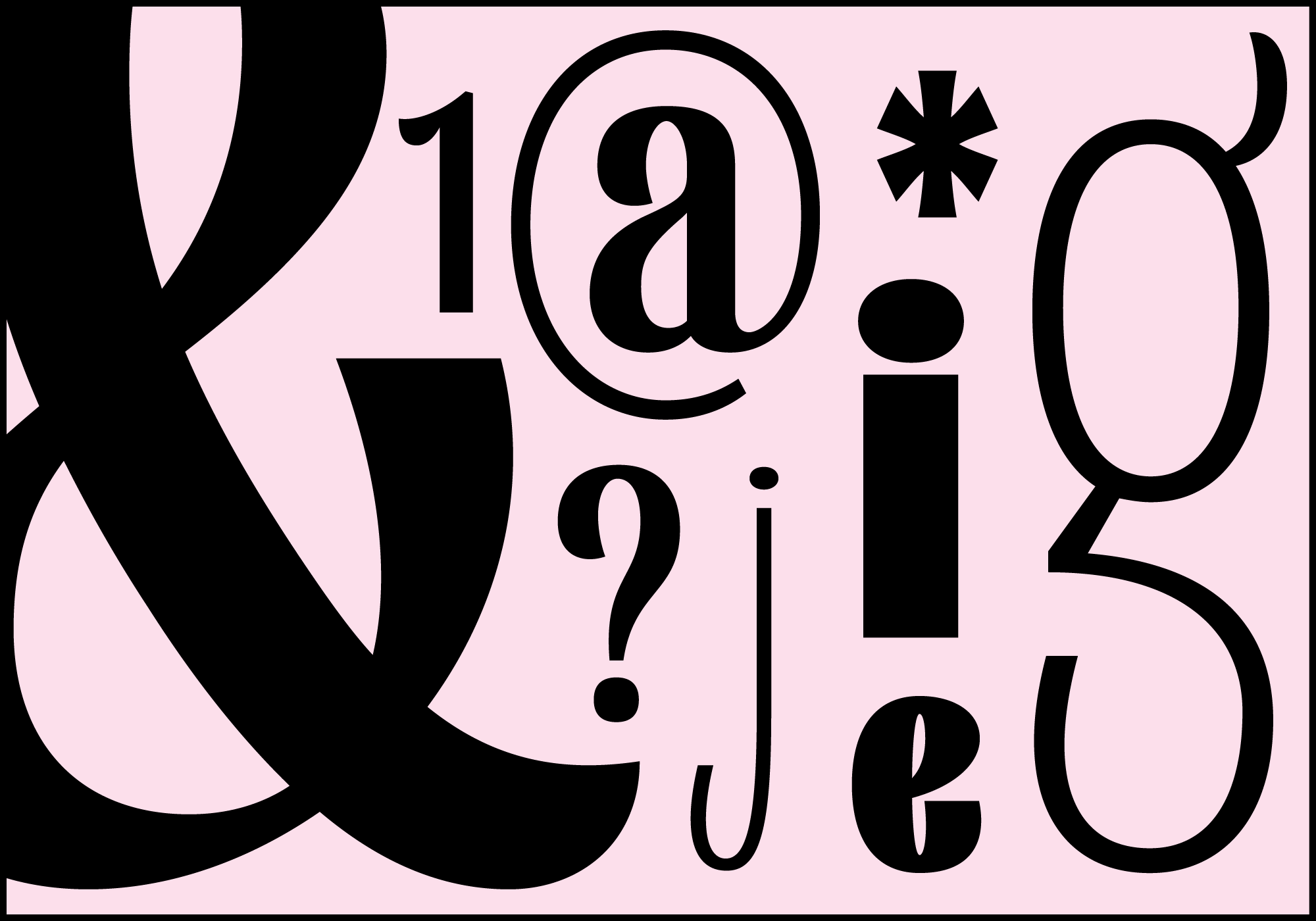
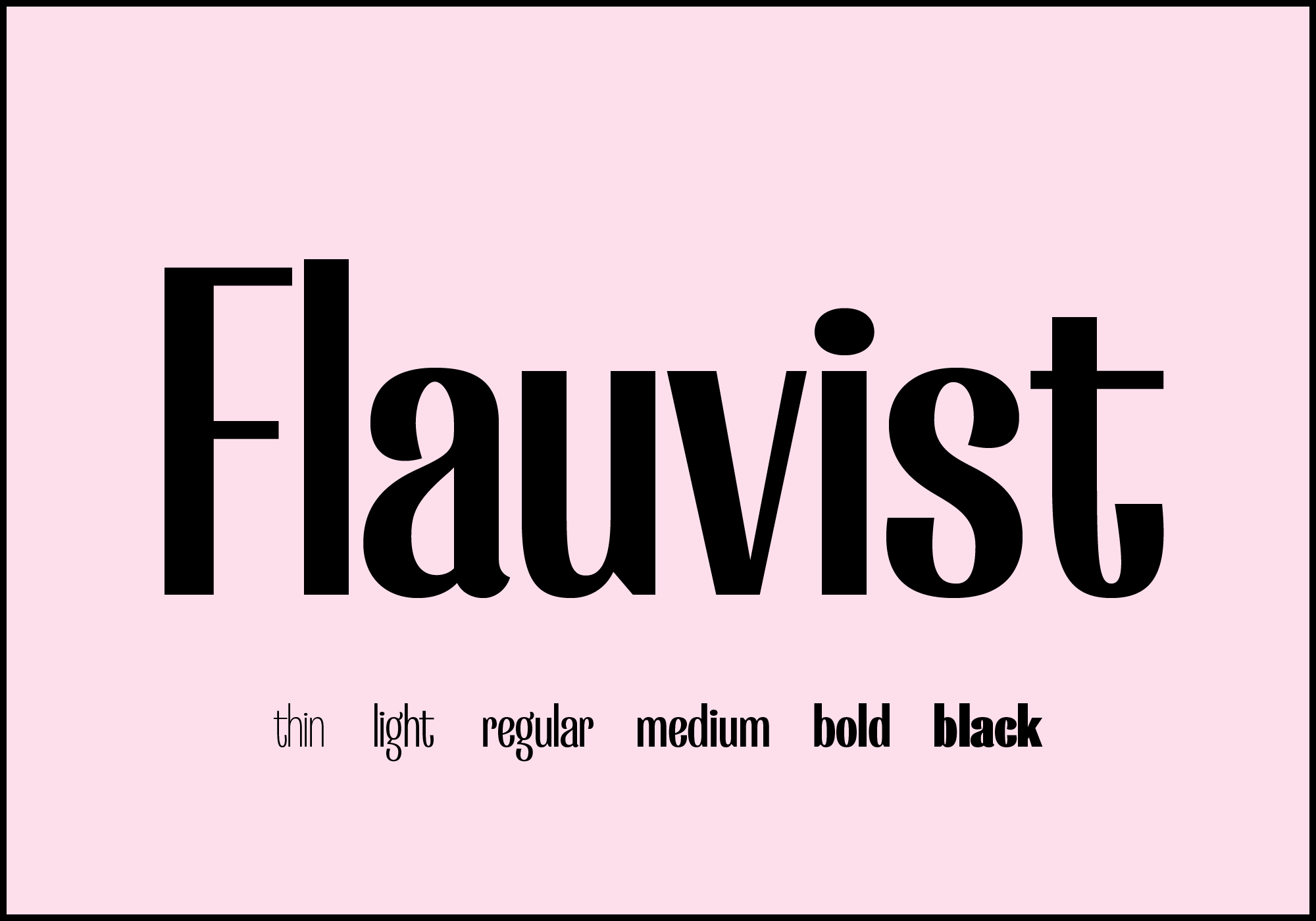
The name Flauvist is a mash-up of “florist” and “fauvist”. The inspiration was to create something that marries intense compressed letterforms, graceful floral curves. The typeface also mixes different terminal styles to create even more variety. When it comes to weights, Flauvist also has an unusual approach. Normally, as the weight of a typeface changes, the contrast stays relatively stable. Which means “light” and “bold” of a high-contrast typeface would both be high contrast. However, the contrast in Flauvist increases with the weight. Flauvist Light look almost like a monoline font, while Flauvist Heavy has some rather dramatic contrasts, creating a more interesting effect, especially when used as a variable font.
Flauvist is intended to be used at all sizes. When it’s used for large sizes, people can really appreciate the beauty of the beautiful curves. On the opposite side, when it’s used for small text, all the little details can add some interesting texture to the paragraph.
Over the years we see more and more specialization in type design, we create different versions of the same idea to fit for different environments and use cases. It’s amazing. It really shows that design is an endless pursuit of perfection. But I think there’s also something interesting on the opposite side, which is to blend them all together.
© Yihuang Zhou